Thursday, June 7, 2012

5/18-5/20 Angels vs. Brown Padres, Blue Padres, Camo Padres

The San Diego Padres are boring. There, I said it. They have no offense. They have no offense because they play in a stadium that would be better suited for cricket than baseball. They have no stars. Hitting 30 HRs as a member of the San Diego Padres is a Ruthian feat. To top it all off, the uniforms that this team wears are just as boring as the brand of baseball that they play. They are baseball's vanilla.

Now that I've got the disparaging remarks about the Friars out of the way, time to shower them with admiration and fascination.  During their weekend series with the Los Angeles Angels (of Anaheim. I'm not trying to get sued by that city.), they injected a bit of personality and quirkiness into their look on that particular weekend. Don't believe me? Then please sir, please ma'am, allow yourself to fall deeper into this well of reading.

FRIDAY: 70s FUNKY DISCO JOHN TRAVOLTA AFRO PADRES

On this particular Friday night, deep in the heart of Southern California, the Padres decided to break out their 1978 home uniforms. The Angels, who had their fill of throwback-mania last season, decided not to comply. This led to a pretty odd-looking game from an aesthetic point of view. The Angels' current uniforms aren't exactly the Miami Marlins when it comes to modern baseball uniforms, but they're still pretty futuristic looking compared to the art-deco look that the Padres have going on. I mean, seriously, look at this uniform, and more importantly, the hats.


Everything about that hat just screams "Oh wow, it's 1978. Let me pop in my Willie Hutch 8-track while I drive my Pinto to the disco so I can whisper sweet nothings into the ear of the honey with the biggest afro in that club. Out of sight. While I'm at it, let me put on this brown-&-yellow hat because nothing screams out the 70s like weird-looking baseball hats. Far out!" In all seriousness, though, it's definitely a hat & uniform look of it's time. Funky color combination? Check. Pullover? Check. Waistband instead of belt? Check. Only things that were missing were the weird mustaches and the stirrups. Would've been an extremely cool-looking game had the Angels decided to play along w/ Turn Back the Clock night. But this was just awkward-looking. Ah well.

SATURDAY: BLUE "meh" PADRES


I covered these unis way back in November when they unveiled the changes, and now that I've actually covered it in action, my opinion on them is solidified: It is the most "meh" alternate uniform in all of baseball. It's really hard to believe that the Padres went from looking as quirky as they did on Friday to looking like baseball's version of Ambien in the span of 24 hours. Nothing about the uniform is really all that unique, and the hat falls in line with the multitude of navy crown-navy bill-white lettered hats that are all over baseball right now. Not to say that it's a bad uniform...but it's definitely a boring one. If you haven't fallen asleep by this point, then you're about to be rewarded for staving off your slumber with:

SUNDAY: CAMO PADRES


This is the regular Sunday home uniform for the Padres. San Diego is a city with strong military ties, so it's only right that they pay tribute to those military ties with a uniform like this. They've worn camo-heavy uniforms since 2006, and they made the switch to the digital camo in 2011.

When it comes to the jersey, the digital camo looks much better in my opinion than the 2006-2010 jersey, which looked like they slapped a green Padres script on top of a camo shirt that they bought from Dick's Sporting Goods. The digital camo falls in line with what you see our beloved U.S. Troops wear. However, the green hat that went with the 06-10 uniforms trumps the brown monochrome hat that goes with the digital camo. So, while I prefer the digital camo as a uniform, I still wish that they could've found a way to keep that awesome green hat.

However, the reason why this particular series was the subject of this blog was due to the fact that the Padres literally looked like 3 different teams during this weekend. I can't remember another series where a team wore 3 wildly different uniforms over a 3 game series. It's fascinating, and only a team with the scattered uniform history of the San Diego Padres (those words are all 13 links, not just one, btw) could pull off something like this. 

However, the Padres looking like 3 different teams over 3 different days wasn't the funniest part of this thing, oh no. Take a look at the 3 pictures below:


The funniest part was that the Angels, in contrast, wore 1 uniform and 1 hat all weekend. Padres, Angels, y'all so crazy.

Image credit goes to gettyimages, AP, mlb.com.

Monday, May 28, 2012

IT HAPPENED

My friends, the picture that rests above this blog post is not an optical illusion. That is not a photoshop. That is not a figment of your imagination. That is not a delusion brought on by eating too many ribs, downing too many cold ones and erstwhile surfing the internet in your state of intoxication. No, no, no, & no. Ladies & gentlemen, for the first time since 2004 (I guess), the Colorado Rockies played a Major League Baseball regular season game wearing PURPLE HATS.


I'm gonna repeat that just in case you've fainted due to the state of delirium that you are probably just now recovering from: THE ROCKIES FINALLY WORE THE PURPLE HATS.


Now, I have no idea what brought about this miraculous occasion in the annals of baseball's aesthetic history. If I had to guess, it was probably the result of the fact that they had to do a doubleheader today with the Houston Astros (speaking of which, what a great day to be a baseball fan in Denver (and in Houston if you're willing to be in front of a TV or radio all day); a doubleheader on a holiday? I'll take that a million times.) and whoever's in charge of uniform combos out there finally decided "You know what? I'm sick of wearing these black hats eleventy billion times a year. Let's put some color in here!" and they did just that.


Seriously, that uniform looks SO much better with the purple hat. It's a shame that they didn't have matching purple batting helmets, but at this point, beggars absolutely cannot be choosers. I'm just happy that they finally decided to let this beautiful beast out to roam in the mountains. Thank you #Based WhoeverDecidedToHaveTheRockiesWearThisCap. Your efforts are greatly appreciated by the fitted cap fiend.


Photo credit goes to Getty Images & Major League Baseball.

Sunday, April 15, 2012

April Update: The (Red)White Sox, among other stuff.

So, earlier today (or Sunday, since it will be Monday when this thing gets posted), I decided to catch the end of the Tigers-White Sox game on WGN. I observed 2 things while watching this game:

1: Hawk Harrelson is quite possibly the biggest homer on the mic right now.
2: The White Sox were decked out in red. Yes, the White Sox were wearing red sox (haha, I am TOO clever.). The Southsiders have decided to add their 1972 home uniform to their 2012 set, and they went all the way with it. Oversized numbers that were standard for that era? Check. Correct sleeve patch (and matching batting helmet? It's a big problem in baseball nowadays.)? Check. STIRRUP SWAG?!!?!??! CHECK!!! Now, this is the Fitted Cap Fiend, so of course the focal point around here is the cap. So, did they get the cap right?
They sure did. Yes, that is the inspiration for what you see on the current black-&-white White Sox cap (which is pretty awesome in its own right).  Even though the 'SOX' script on the hat doesn't match up with the script that is on the chest, the #1 goal for a throwback uniform is accuracy, and it's accurate. 

Plus, it's kind of awesome to see a team nicknamed the White Sox playing in red in the same league that includes the Red Sox. I'm sure that caused a bit of confusion back when this was what the White Sox wore on a regular basis, instead of just on Sundays for a year. Either way, it's a solid look for the White Sox, a nice change of pace for Sundays, and a decent infusion of color in an identity that gets bogged down by the team choosing to wear their black jerseys for like every freakin game. Good job by the White Sox for getting everything right, and I'll be looking forward to every time that they decide to wear these nice hats.

-------------------------------------------

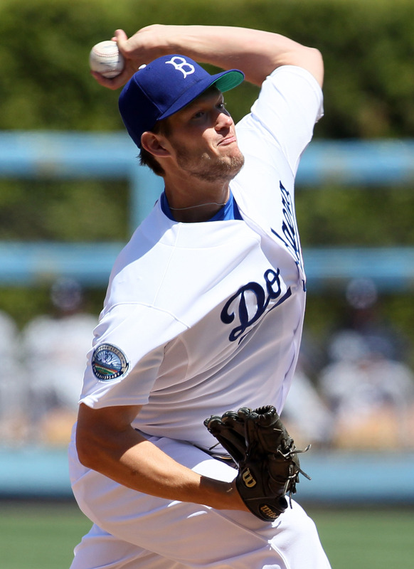
In the meantime-inbetweentime, the Los Angeles Dodgers (led by Matt Kemp, who is on pace to become baseball's first ever Eleventy-Eleventy Man) honored the legendary Jackie Robinson by breaking out the Brooklyn Dodgers cap. Here's a pic.
Now, we saw this hat last year when the Dodgers wore throwbacks from 1944 for a few games, but it's always nice to see this hat paired with one of the best home uniforms in baseball today. Brings back memories, doesn't it? Now, while the hat may not be completely accurate (to make a long story short; that hat logo has gone through so many minor changes that it's almost a completely different animal than what guys like Jackie, Pee Wee Reese, and Roy Campanella wore), it's still a classy compliment to a classy look. So yeah, points off for inaccuracy, but when it looks that good, who am I to complain?

So, really wasn't expecting a random post at 2:00 AM EST writing about two teams who went to a throwback look for Jackie Robinson Day to be my first post in months, but here we are. C'est la vie. Baseball's back!

Photo credit to the following: 30fps, Getty Images, Yahoo Images, mlb.com