First off, it’s been way too long. Secondly, WHOA. First we get that crazy World Series (congratulations to the Cardinals on their 11th trophy. Shame that it somewhat came at the expense of my beloved Braves collapsing like a Jenga tower during the pennant race, but that’s neither here or there…), and now this? 6 (SIX!) teams have all either made tweaks to their visual identity, or they’ve completely overhauled it. Needless to say, this has resulted in a cornucopia of new hats! Thanksgiving’s come early for the Fitted Cap Fiend, and like any red-blooded American during this time of feasting, I’m gonna dive face first into this crazy turducken meal of baseball caps and other stuff! So here we go, starting off with:
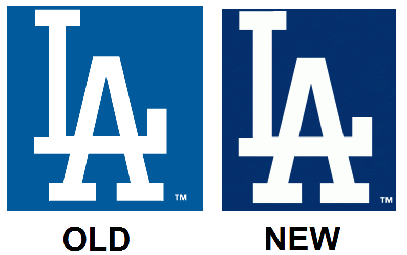
Los Angeles Dodgers (?!)
Yep. Believe it or not, the Dodgers kicked things off here, and unless you had a keen eye for this type of stuff, you would’ve missed it. But, the change definitely happened, so why not comment on it?. The iconic interlocking LA logo has been slightly modified for the 2012 season. While this wouldn’t be cause for celebration or jumping for joy, it’s good to see that even teams like the Dodgers are willing to make tweaks in order to make their identity even better than it already was. In the Dodgers case, they didn’t need to make much of a change at all, but the change that they made was still an improvement.

San Diego Padres
The second club to unveil its’ identity changes was the San Diego Padres, who made a bit of a lateral move here. For the past couple of years, their colors have been blue & khaki, with two separate caps for home & road games. Both were pretty straightforward, with the home cap consisting of a stylized & interlocked SD logo, and the road cap having the same logo, except colored in khaki & outlined in white. Personally, I was a fan of the road cap. If you were a fan of that cap, then you were probably disappointed with the unveiling which saw that cap go bye-bye. Shoot, if you were a fan of exciting redesigns, then you were disappointed here as well. The de-emphasis of khaki in this identity has turned it from one of the more interesting ones in the league to one of the most boring, and the same goes for the cap. A khaki outline around the letters (like they did for their batting practice caps) would’ve done a good job of distinguishing this cap around the league. Instead, we’re stuck with another navy cap with white letters in the league. Woopty-doo.

Miami Marlins
So we go from two nondescript changes to this 100%, wholesale, “Let’s act like we didn’t exist before November 11, 2011” change. When this logo first leaked on the internet, my initial reaction was “WOW! That is FUNKY.” Considering that my favorite era of baseball caps & uniforms was the Pullover Era from the 70s & 80s, that’s a compliment. Light blue, yellow, orange, white, silver, & black with an abstract Marlin jumping from the stylized M. Say what you want about the color scheme, one thing you have to say is that it’s unique. That uniqueness is what makes me enjoy this identity so much. That uniqueness is what makes this black cap stand out from the rest of the black caps in the league, and that uniqueness is what makes this funky, funky, FUNKY ORANGE (and the above image doesn't do it justice. Click on the link near the end of this entire post to see the hat in its natural environment. "Bright" would be an understatement.) cap stand out from pretty much anything you’ve seen in Major League Baseball to date. While I’m not exactly a huge fan of the uniforms (except for the even funkier orange jersey, which I’m planning to have an affair with sometime soon.), the hats are amazing. Miami’s definitely going to stand out from the rest of the pack with this identity, and in this age of every other team wearing a navy-or-blue hat with white lettering, you really can’t ask for much more.

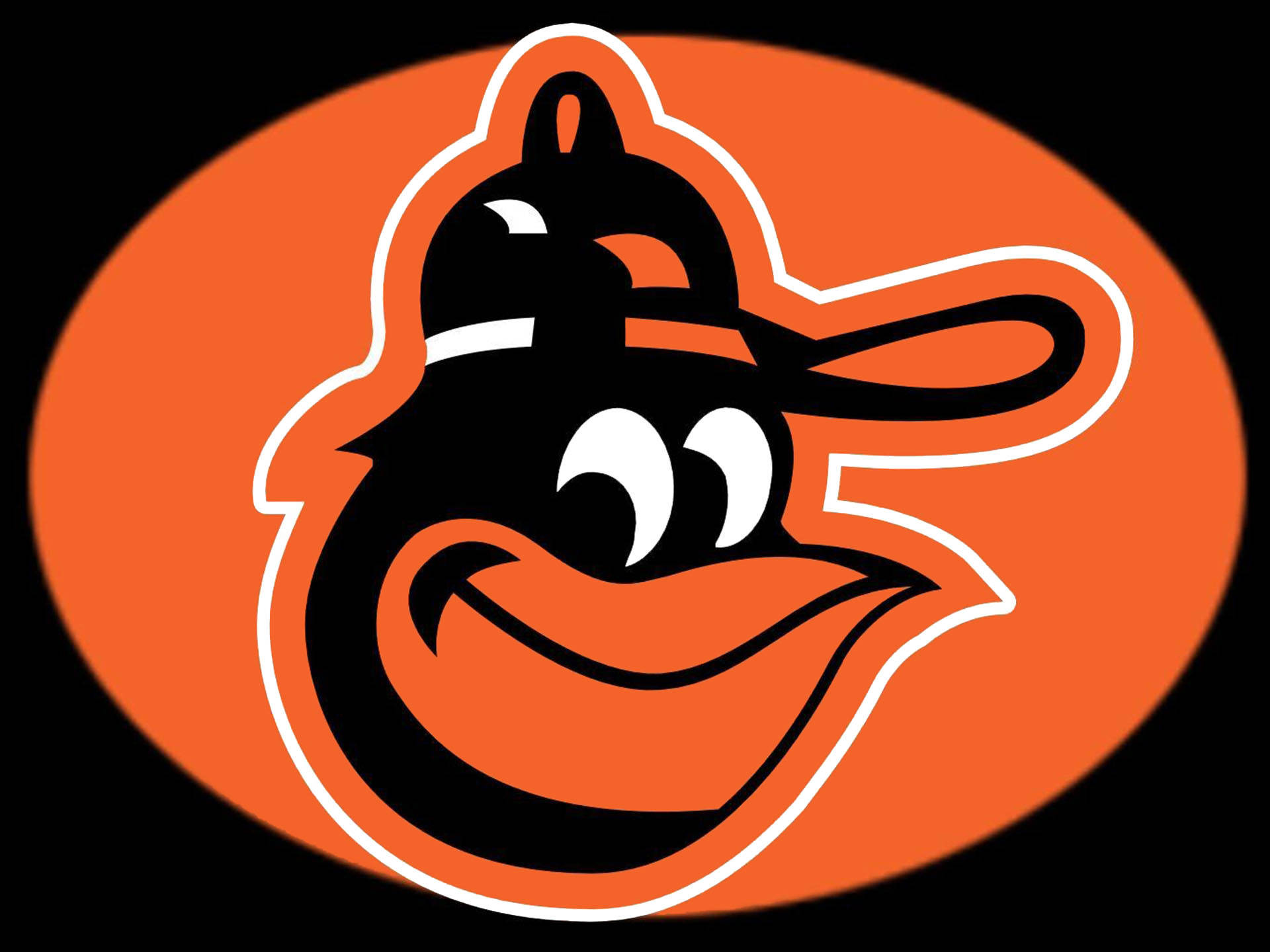
Baltimore Orioles
Not too many changes here uniform wise, but hat wise, the Orioles made one of the best decisions in the history of their franchise concerning their visual identity: They went back to the Cartoon Bird. Yes, the little goofy-looking bird’s head that graced the hats of legends like Reggie Jackson, Brooks Robinson, Eddie Murray, Earl Weaver, & the entire Ripken clan. THAT little guy is back, and he’s styling and profiling as he gets ready to make his return in 2012! Personally, I never got behind the realistic-looking bird for the Orioles. My favorite memory of that team was the entire 1979 World Series w/ the Pittsburgh Pirates (quite possibly the only World Series in baseball history that ever burnt multiple holes into many Americans’ television screens due to the fact that TVs back then could not handle the bold & bombastic colors that both teams wore throughout that series, but I digress), and it was mainly because of the uniforms. While they haven’t gone crazy or anything and actually brought back the pullovers, they did bring back the Cartoon Bird and included him on a very sharp-looking black cap with an orange brim. Not only did they do that, but they brought back the white-paneled caps! YESSSSSS! Whoever’s in charge of this thing in Baltimore must’ve been sipping on the Awesome Sauce the day that he or she made this decision. Normally when baseball teams throw back to the past, it works. This not only worked, it was a grand slam. Well done, Baltimore!

New York Mets
The only reason why I’m including this is because the color black’s stranglehold on this franchise has finally been loosened! That’s right; the black cap with blue brim is dead. The all-black cap (and the black alternate jersey) still exists, but it’s better to go all the way black (there’s a joke in there somewhere) than to run out in that black-&-blue hodgepodge that they used to wear on a regular basis up there in Queens. Anyways, the story here is mostly about the uniforms (which are beautiful, by the way), so we won’t spend too much time on this one. The classic hat is now accompanied with classic uniforms, which is all that baseball fans have asked for about a decade or so now.

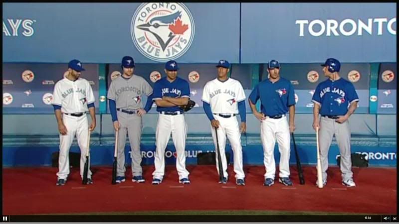
Toronto Blue Jays
Our good friends up north who run the baseball team in Toronto finally got a clue and realized that the team is nicknamed the BLUE Jays, and now they will be dressed as such. The Graphite Jays are dead, to the chagrin of all 3 baseball fans who enjoyed that look. The Blue Jays will take to the field next year with one of the classiest looks in the league. It’s a modern take on the look that defined their back-to-back World Series victories in 1992 & 1993, and the designers knocked it out of the park. The hat itself is a GIGANTIC upgrade over the weird-looking bird’s head flying out of a beveled J that they wore for 7 years. Now, we get the modernized classic Blue Jay on a royal blue hat. It’s simple, but it’s elegant. Simply put, this is what the Blue Jays are supposed to look like, and this is the hat that the Blue Jays are supposed to wear.
So there you have it: 6 changes in Major League Baseball and most of them were upgrades. Some teams made small changes; others took a huge leap from the past; while others chose to pull inspiration from the past. Personally, here are my favorite caps from this offseason in order (not gonna include the Mets or Dodgers here):
- Orange Marlins (The most unique cap in the league, IMO, and it also might be the best one that isn’t an established classic.)
- White-panel Orioles (Seeing the old bird come back in THIS style was amazing. Never thought I’d see this type of cap return in 2011, but it happened, and I love it.)
- Blue Jays (Solid-looking cap here. HUGE upgrade over what they used to have, and fits right in with the team’s history)
- Black-&-Orange Orioles (Cartoon bird returns on a more straightforwardly designed hat. I prefer the white-panel, but this is a good hat in itself.)
- Black Marlins (Not as daring as its Orange cousin, but it does the job, and will serve as a good primary cap going forward for the team)
- Padres (Boring.)
Rumor has it that there may be even more changes coming. Either way, it’s a good time to be a Fitted Cap Fiend, especially with the holidays right around the corner. With these designs, I have a feeling that most of these teams are gonna rake in some serious dough thanks to some great changes.
All credit for images used go to Chris Creamer's excellent sportslogos.net.
Got some knowledge you want to drop? Feel free to comment!
No comments:
Post a Comment